


Dev Blog 2: UI and Why
- Nov 26, 2017
- 9 min read
Working on the UI for Iron Legacy this past month has been an adventure for me. Most of the back end stuff is done for the inventory, the buttons surrounding the mini-map work as expected, and the hot-bar came out a lot better than I was expecting. In fact, everything came out better than I expected. I'm not an artistic person at all, but this was actually quite fun. I also learned a ton about the UE editor and was able to veer away from tutorials and other forms of help on most of what I created.
Let's start with the Equipment Panel
The Equipment Panel was the first item I worked on, first I'll show the finished(We all know its never 100% finished) product, and then I'll be showing the stages it went through to get there. So here it is right now:

Well, why? From the top down, left to right, we have the Head, Cape, Neck, Shoulder, Weapon, Torso, Shield, Hand, Belt, Ring1, Leg, Ring2, and Boot slots. This looks like a ton of slots, and it kind of is! It's interesting to me that I worked on this first as it would have made more sense to work on the combat system and the hot-bar before this to make it more streamlined. However I'm happy with this choice as it allowed me to get those two things straight in my head. Why so many slots you ask? Well...
1) I'll come out and spoil it right off the bat. The Cape/Shoulder, Belt, Ring1, and Ring2 slots are all directly linked with the hot-bar. I know you don't know much about the hot-bar yet but use your imaginations for now. At first you will also notice that weapons show up on the hot-bar but have no use. As you progress this will change.
2) Wait, Cape/Shoulder? Yes. The Cape and Shoulder slots are linked. I'm willing to change this, but I think it is logical for the game. This should make more sense once we get more into the hot-bar section, but I think the choice between extra shoulder armor or a cloak is going to add more than it takes away. Quivers will also go here.
3) This may be obvious, but I'm going to state it anyways. When wielding a 2-Handed Weapon(Mauls, Greatswords, Bows, etc) the shield slot will not be available.
4) I debated between a Hand slot or a Hand and a Wrist slot and adding the wrist slot to the hot-bar as well. I decided to combine them for simplicity sake.
5) In the end, more slots is more customization, and more customization is more interesting. It is also freedom. And if you didn't get the message, I am all about freedom. Don't like the second ring slot? Don't use it. I bet you'll use it though.
Let's go over how I made this. I started off with a new Widget Blueprint in UE4, and started drafting slot sizes and whatnot. I ended up with 50x50 slots and so far I don't regret it. The process of ordering them was exactly how I described earlier.
And here is how it looked in game after setting the anchors properly:

At this point I needed Icons. So, like any non-artistic person I Googled free assets. I ended up at game-icons.net and it is without a doubt the most helpful tool I have come across outside of UE itself. Basically it is a huge collection of icons made by wonderful artists, mostly under the Creative Commons License. There is an editor on the website that is so powerful it's not even funny. You'll see what I mean when we get to the Skill Panel. It is an absolutely amazing site.
I spent a huge amount of time being picky about what Icons I wanted to use, and I came up with this:

Again, being the non-artistic type I was super proud of this, so I showed it off to my girlfriend. She quickly corrected me on a few things that made a lot of sense and I came back with this:
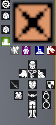
The other Icons are buttons to toggle other interfaces, so ignore them for now. Some changes to the equipment were obvious but others not so much. First, the direction of the shoulder slot was swapped to be more in line with the perspective. I also changed the sword and shield to be more medieval and flipped the sword to point out for perspective. The gloves were also switched out to represent both hands instead of one.
I'm very happy with this, but if you have any recommendations for improvements I am all ears.
After reorienting the icons, I added a placeholder background and converted all of the placeholder UE buttons to some custom slots I made.

During the initial writing of this blog this was actually the final product. However, while working on the inventory I had some ideas about presenting the stats to the player without having to open another window. The widget spawns when hovering over the equipment slot and presents all of the combat stats in a nice box. The widget disappears when not hovering over the slot. I decided to just keep it in a static location, as making it translate depending on the slot hovered seemed like unnecessary clutter. As will be the case with the inventory, when you hover over a slot a yellow border will appear just so there is not confusion on what you're clicking on at any given time.
The inventory
I followed this tutorial by UnrealGaimeDev on YouTube for my inventory as I was not comfortable with designing it myself. As he went along with it I determined what I did and did not want in my system and changed things accordingly. I really recommend this channel even if you don't think you will be implementing some of the things he has done.
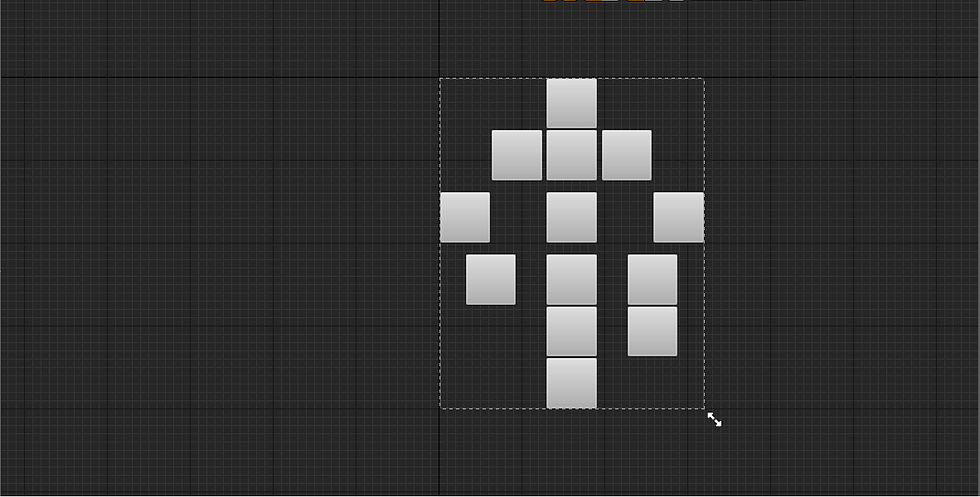
The inventory is a 5x6 grid. This was my choice because I believe 30 is a balanced number to work with, and it fits on the screen nicely, being easily accessible without being in the way.
Here it is full of placeholder stuff:

Each of these slots can be swapped with each other including stackable items, and there is also a right-click menu that isn't totally completed due to some complications that I don't think I will be able to fix until I start working on some back-end items required for a playable demo release.
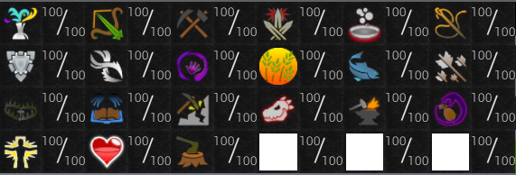
It follows the same suit as the equipment panel with the yellow border on hover. I'll let you determine what exactly the stacks of 100 are, however I will confirm that these two particular stacks are in a category of items that are capped at 100 for a reason and that other stackable items not of the same category have a totally different cap (limited by c++ itself so it's pretty big).
Next was the Skills Panel
This was hard. Not logistically, a simple grid fit the bill, but from a spatial standpoint. I wanted every skill to be visible when you hit the button, I wanted them to be easily Identifiable, and I wanted the text to be readable for everyone. The result, in my opinion, is not perfect:

Yet another spoiler! Indeed the max level for each skill will be 100.
I had to do the testing with the largest number that would ever be in each skill slot, for logical reasons. Little did I know that making the max level 100 did me no favors in my space utilization. I really think the skills tab is too big, but it closes with one button and if you are doing anything that requires you to monitor your experience points or levels closely you wont need other portions of the UI at the same time. I could be wrong. I'm probably wrong. But for now it stays.
Now, back to game-icons.net! I spent an entire day designing these Icons. I needed them to be perfect. Skills are such a huge part of this game, and their icons, even if these end up being just place-holders, are very very important. I won't be revealing any names yet, but here they are. All 21 of them.
That last sentence was actually exciting to write. 21 Skills is a big undertaking, but It's exciting. The last three slots will just be textures, I promise I'm not holding out on you. Please Please Please, speculate in the comments or on the sub reddit! Whoever guesses all of them gets a prize (no, that's not a joke).
On to the Quest Panel
I had trouble with this one too. Not because of space constraints, but because of informational layout. I'm still not sold on what I have, But the widget is set up to allow expansion. Things I have considered is adding stars next to the name denoting difficulty, or dividing them into sections to do the same. The quest names will be different colors depending on if you have not started, started, finished, or claimed your rewards. Obviously I can't demo this right now because there are no quests. But man do I have some good quests in mind for the first couple batches. So here it is:

It can be toggled by the blue button.
Let's move on to the spellbook.
I spent a lot of time pondering how exactly I wanted to implement magic combat. I had considered quite a few options, including simply storing spells inside of the weapons themselves. I ended up with something I feel provides balance to the combat system.
It was mentioned earlier that quivers would take up the shoulder/cape slot on the hotbar. With this information it would have been logical to assume that Archers were at a direct disadvantage in combat due to them having one less slot available. Because of this I determined that magic would require the use of tomes in the belt slot to provide mages with their spells. I'm worried this will always make melee superior in combat, but we will have to look into that more in another blog. So here is how it works:
Step 1: Equip Tome

Step 2: Open Spellbook Panel

At this point this is all visual and not usable. The idea is that you will be able to right-click any spell and assign it as your primary attack, and that you will also be able to left-click any spell and it will queue itself to fire off on the next attack without wiping your primary spell setting. Hopefully this gives some good insight into the spell system.
Portraits
I got a little creative here on the back end. During some of my searches when trying to solve logistical problems, I
found out you could actually render a live image into a widget in UE4 with a little tweaking. I'm not aware of the total performance impact this has, but I'm planning on using this conservatively under the premise that over-use will cause performance degradation. When I say conservatively I mean one per monster, and one per resource. I also wont be rendering the actual object, but rather another model outside of the level that will be updated in tandem with the live model to further lower the performance impact. Here they are up top:

And then up close:

If you look above the skills button, you will see a button for toggling the portraits entirely, and above that another button for opening some customizations of the portraits. Right now these customizations include swapping locations, and turning off the enemy portrait in exchange for a skilling portrait.
The portraits themselves contain three bars which will be covered more in depth in the combat blog, but they're basically each a combat resource. The light green bar on the bottom is a health bar, and right above that is the player's name along with their level. The enemy portrait is the exact same thing, but for whatever the player is currently fighting.
You may have also noticed the first image contains the skilling portrait. This displays whatever skill you are training and will have some helpful information in the future for players interested in the metrics of it all.
But what about the hotbar???
I mentioned in the very beginning how much I learned about the editor. The hotbar and the equipment panel were the biggest examples of this. As I worked on the hotbar, I actually went back and updated portions of the equipment panel to match. That's why you have such a detailed showcase of the equipment panel development process. The finished product for the hotbar looks like this:

And if you hit the little box to the left of it:

Just to reiterate, the hotbar slots and the corresponding equipment slots are directly linked. What is different between the two will be their single click and hover menus. The single click will activate whatever the active ability is for the equipped item if one exists, and then begin it's cool down period after it has been activated. The hover menu will display any relevant information directly above the hotbar, as well as spawning the equipment stats screen in the same spot as seen in the equipment panel. It will not be possible to unequip items via this bar.
The white box is going to be mostly informational. And not as ugly. Examining items will result in text being logged there, and other things like that. I'm not planning on logging conversations with NPC's down there, but I can see the use in it for quests if you decided not to read what the NPC said and then don't know where to go next for your quest. I added the minimize button because I don't plan on it being necessary for gameplay, just an addition. More freedom is good.
So there it is! The first draft of Iron Legacy's UI! As previously mentioned this was a big experience for me, and I'm sure I will change my mind on a few decisions. I truly hope this blog inspired some more confidence in Iron Legacy for those that read the first blog and didn't see much content. Next month will most likely focus on the development of the spawn city, and possibly some of the quests that will be inside of it's walls.
I also want to mention that I set up a subreddit here and would love to hear some feedback. I'll set up some other Social Media as time goes on, but for now just Reddit.
Thanks for reading!
Comments